Kids First Saturdays: Hockey Logos
Learn to design your own hockey team logo during our in-house Kids First programming on Saturday, July 25th 2020. Our new Covid-19 plan is meant to ensure a safe experience for all.
Registration for Kids First programming can be done by emailing s.bernard@thepolygon.ca.
INSPIRATION
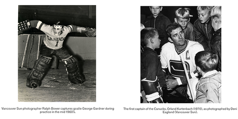
To celebrate the reopening of our ground floor gallery, we are pulling inspiration from the works in the exhibition The Canucks: A Photo History of Vancouver’s Team.
For anyone visiting the gallery, download and print this ‘Seek and Find’ document before your visit, to help you look closer at the photographs in the exhibition. Or, use your personal device to look at it as you go through the exhibit with your family.
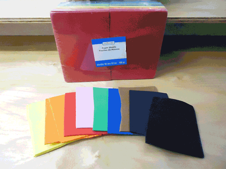
STEP 1: GATHER MATERIALS
- Coloured foam sheets (Easier alternative: coloured construction paper)
- Scissors (With adult supervision: pen/exacto knife)
- Hot glue gun (Easier alternative: stick glue and/or Scotch tape)
- Pen/markers
- Fun extra: magnetic tape
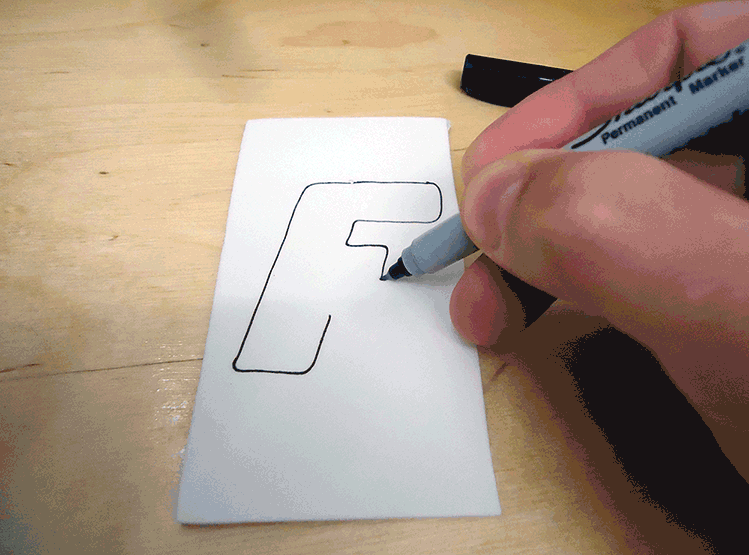
STEP 2: CHOOSE A SIMPLE, OR COMPLICATED, IDEA FOR YOUR LOGO
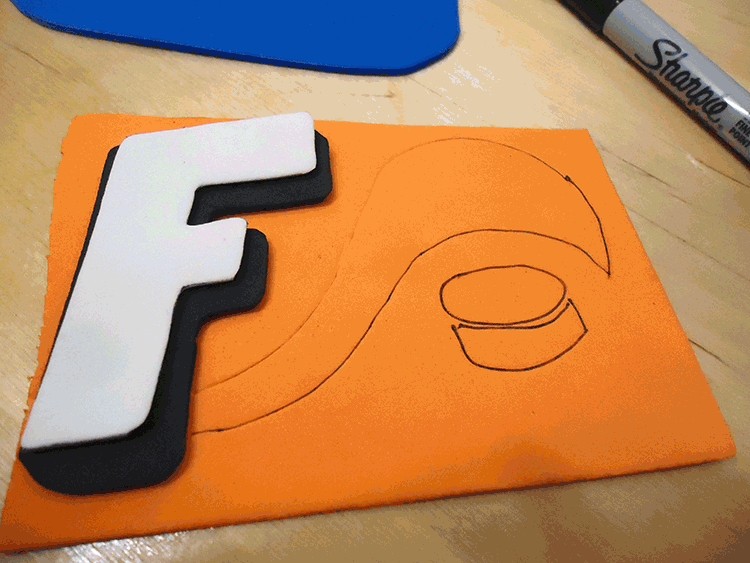
Most hockey logos are simple. They choose the name of the city, or use only the first letter of this word, to make up the main image. Start by using the first letter of your name as the idea for your logo, and choose your favourite colour as a starting point. Cut out the letter from this colour of foam. Or another simple idea would be to use the image of a skate, hockey puck or stick as a starting point.
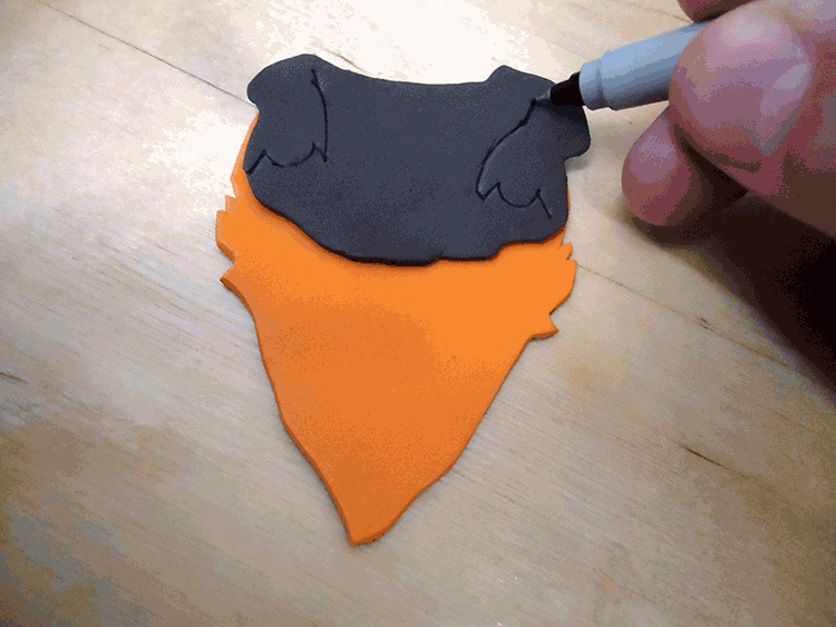
More complicated logos use a symbol or animal as the main idea. Once you’ve had some practice, choose your favourite animal as your team name. Use the coloured foam that best suits your animal as your starting point, and draw the animal before cutting it out… but only cut out the body shape, as the details will come later. PRO TIP 1: Fold the paper in half when drawing the outline of your animal face, to create a contour that is perfectly symmetrical.

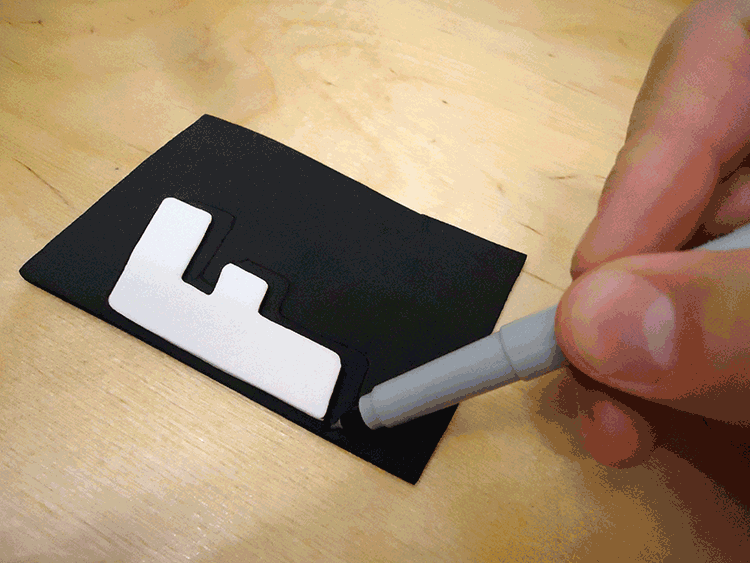
STEP 3: LAYER YOUR MAIN IDEA WITH A DIFFERENT COLOUR
Add a second layer of a different colour under your team letter or animal. Make the contours slightly bigger so that it can be seen all around your original shape. Or use a geometric shape of another colour as a background to your first layer.
The second layer for your animal should give you a sense of it’s skin or fur, and should be a lighter or darker colour than the main contour of the body. This layer should also be smaller that the first, so that you’re adding a first layer of details to their character. Leave the eyes and teeth for last though, as the black/white details are the final step. PRO TIP 2: Use one of the eyes or ears as a stencil to make an opposite and symmetrical match for your animal.
STEP 4: FINISH YOUR LOGO WITH A FINAL LAYER OR TWO OF FUN DETAILS
Many logos with letters incorporate things from nature like fire, wings, leaves, stars or lightening. What objects from life can you add to your letter to make it a striking logo? Once you are happy with how you’ve layered all the parts to your logo, use the hot glue gun to bind them together. Add a few pieces of magnetic strip to the back, and stick it where the rest of the family can see it.
Apart from adding white eyes and teeth, you can make the back of the mouth black or red if the mouth is open, or add a bright colour detail to the side of your animal to give them some energy and to outline his or her features. You can even add a hockey stick or puck at this point to make them look like a team player, as the final touch.

STEP 5: SHARE YOUR WORK
If you share your work online, be sure to tag @polygongallery as we would love to see the hockey logos you’ve come up with. Have fun!